top of page
01 TOOLS
02 PORTFOLIO
2.1 ADS & VIDEOS
2.2 LOGOS .
2.3 WEBSITES
03 SKILLS
04 EXPERIENCE
05 CONTACT
More
Use tab to navigate through the menu items.
02.3
Websites
MICHAEL BUTLER
TENOR
;
A dignified, intertwined, rose-gold word-mark reflects the noble, lyric repertoire of this Juilliard-trained tenor, and a marble motif layering and overlapping elements throughout the site compliment each-other's pink undertones. A moody, dark design with a blue secondary color tie everything together.
BENJAMIN R. SOKOL
BASS-BARITONE
;
For Benjamin's new brand identity, we went for a royal tone with subtle, red brocade, and gold textures wrapping a logo form of elegant serif letters and a crown. We also did a badge version with two falcons opposite each-other, a symbol of majesty and hot pursuit of the object of one's desire; perfect for a rising, young musician, and actually part of Sokol family heraldry!
DARYA NARYMANAVA
TENOR
;
Young, international mezzo, Darya, needed an elegant, feminine look, but not too bright (those pants roles called out for navy and neutrals)! For the logo, we leaned on slavic symbols of her home like the flax flower and natural motifs from gzhel ceramics to create a cohesive brand look, and refined yet naturalistic logo.
MATTEO ADAMS
TENOR
;
Matteo is a fantastic up-and-coming singer who needed a sleek brand as he's increasingly in demand. We wanted to show his maturity as a soloist without aging him, and went for a very
cool
form factor with angles, royal purple and a word mark that plays between angles, curves, and serifs versus sans.
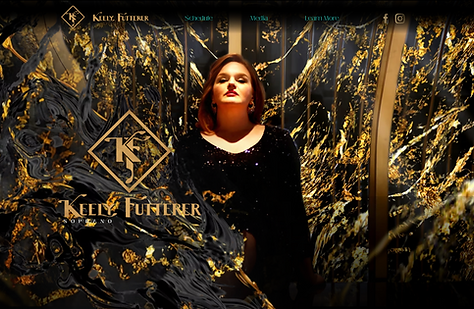
KEELY FUTTERER SOPRANO
;
An art deco word mark, headshots, and website for a soprano with a refined, classic presentation. The logo plays on balance and A-symmetry, and a gold marble abstraction are a motif throughout the whole site build.
ARIANA WARREN
MEZZO-SOPRANO
;
A fresh website and branding for a versatile, rising singer. The curves of the logo convey unpretentiousness, and the texture of the wall on-location in the promo shots is used as a motif throughout, on buttons and through a motivic color pallet.
NICHOLAS HUFF TENOR
;
A custom Celtic knot logo connects to my Irish background, and a weathered font wrapped in gold indicate the stateliness and age of opera. A complimenting landform and quasi map texture in blue creates an intimate, dark setting which pulls through the entire site.
KENOSHA OPERA FESTIVAL
;
The Kenosha Opera Festival was a summer opera festival on the shore of Lake Michigan in Kenosha WI. The Rising east sun over the lake and Kenosha lighthouse are mainstay local views and tie the brand to the community, while the interplay of sunny yellow and orange against black signal fun and cool.
bottom of page